As I am going on with the development of our backend and several new features, Fanny did a very great job in redesigning our homepage. We will be discussing that in a future post. In the meantime, I wanted to share with you an anecdote about the first version of our homepage.
Elokenz v1 Homepage
When I designed our first home, I had no real experience about how to do this kind of business. I rolled up my sleeves and started from scratch with Bootstrap. The only thing I tried to keep in mind was the tips given by Oli Gardner in his Unbounce ebook about conversion-focused designs.
Therefore, the home had few distracting elements and two highly-contrasted call-to-actions (CTA). There is also a quick anecdote about this design : it was thought for color-blind people.
Color Blindess
When I was creating this landing page, one of my co-workers at Lens was color-blind. Color blindness is defined as the inability or decreased ability to see color, or perceive color differences, under normal lighting conditions. Since this genetic trait is present approximately in 8% of Caucasian males, I decided that this could not be neglected for my target market. Eyequant estimates that 108 Millions web users are color blind.
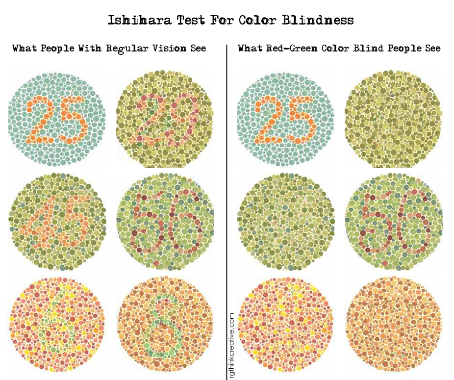
Basically, to discover if you are color blind, you can do the Ishihara test. If you see the same thing for the left and right panels, you’re likely to be color-blind :
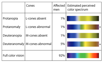
Some colors are more prone to appear than others. An interesting fact is that there are various variations of color-blindness : this means that all colors are not perceived the same by different color-blind people. Here is the color spectrum for these people, it’s extracted from “Color Design for the Color Vision Impaired” article from B. Jenny and N.Vaughn Kelso :
Designing logos and CTAs in a color-blind world
I made several attempts to see what was more consistent among the various kinds of blindness. One thing you should know about color-blind people, is that while most of them see blue they can’t distinguish green from red. So, having a blue logo is fine, while having a red or green logo is bad, because these colors are really different for color-blind people and they might be used by your partners or clients in a context that you don’t control.
![]()
![]()
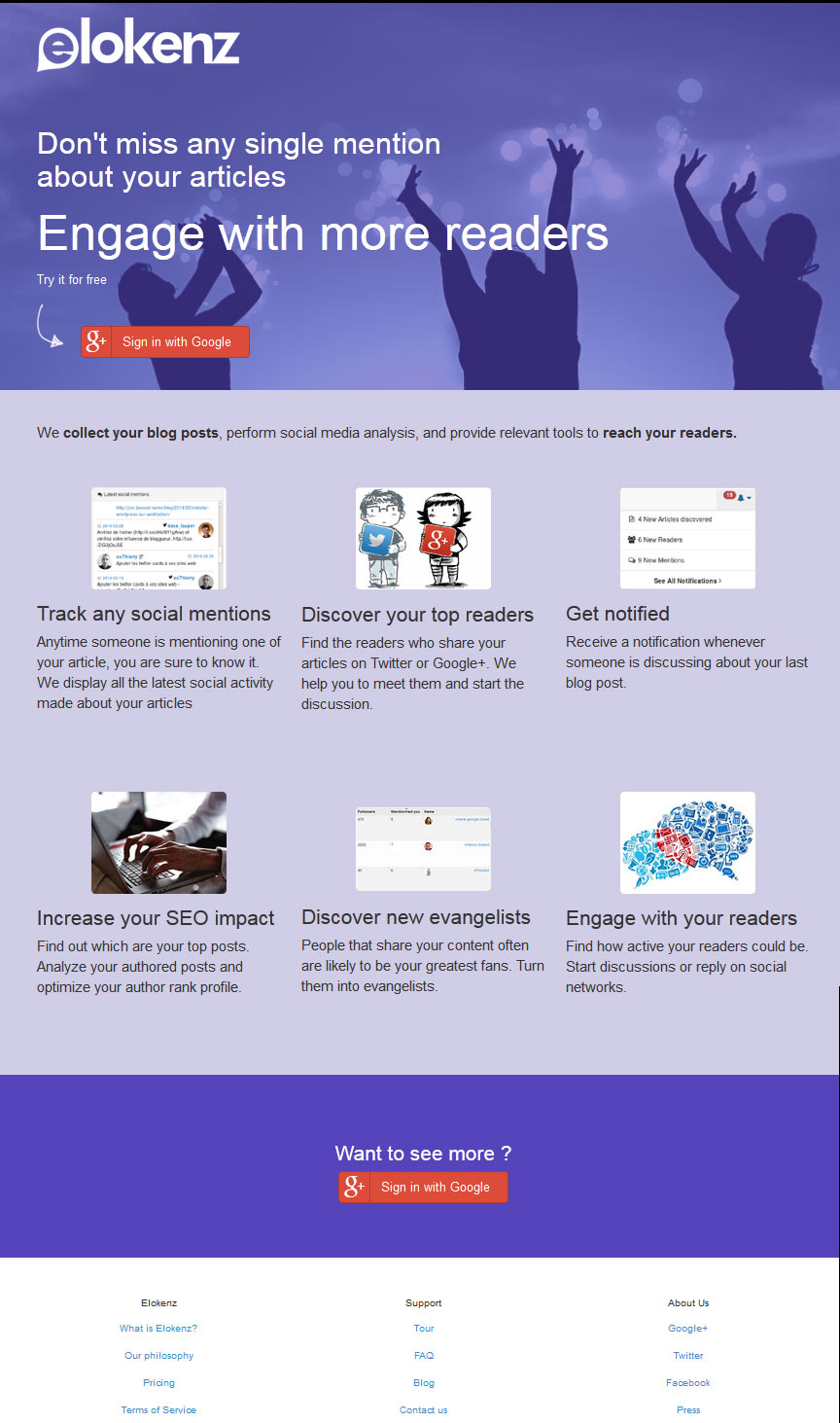
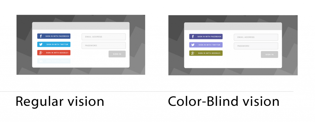
For instance, if your design includes a G+ signin button, you need to pay attention to the background ! You should absolutely avoid green backgrounds. Here is what it looks like for, say, a regular homepage with social logging :
Here you see that blue is not easily confused. This is the reason why hyperlinks are blue. I’ve also read a rumor stating that it is the reason Mark Zuckerberg plumped on blue for the dominant color in Facebook’s design because of his color blindness.
Now you understand why so many logos are blue-ish.
3 Pro tips to enhance your designs for color-blind people
Use tools to help you
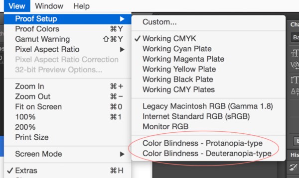
If you ever want to design something for color-blind people, you should know that there is few software out there to simulate that on your own computer. Personally I used ColorOracle to get a quick feeling about my layouts. However, I discovered later that the option is available in Photoshop (under ‘view’ > ‘proof setup’ > ‘color blindness’). This allows professional designers to quickly check their work.
Avoid a combination of red and green
By avoiding red and green, you’re not just catering for the color blind, you’re designing a CTA for the largest possible audience. If you’re not, be aware that contract is likely to change for your audience.
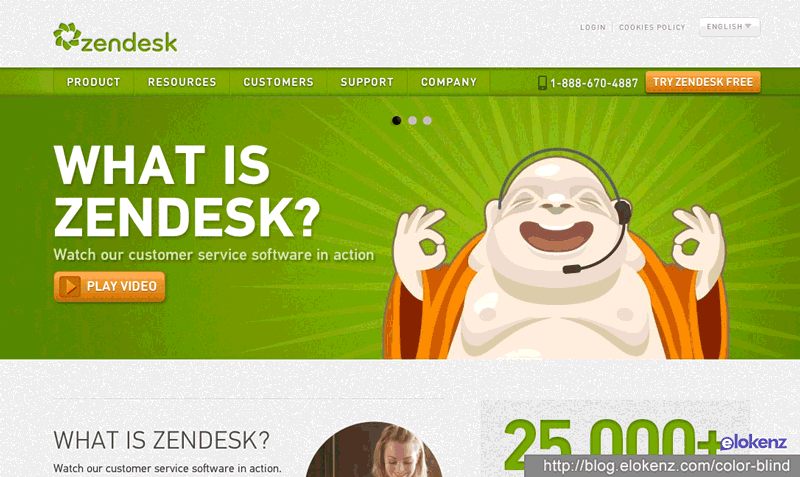
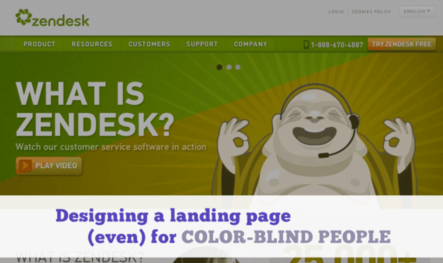
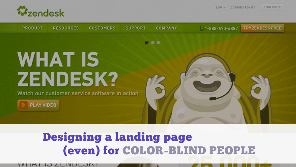
Above you can see that even ‘big’ companies made the mistake at some point. Zendesk is a very clear example of the confusion between green and orange/red colors. Their “Try Zendesk Free” and “Play video” disappear due to the bad choice of colors.
[cta id=’744′]
Orange is great for CTAs
Red and yellow jump of the page, but with red symbolizing risk, and yellow closely associated with hazardous situations, just what color is best for your CTA ? Research suggests that orange is the happy medium – a combination of aggressive red and cheerful yellow. Clearly some of the larger online brands like Amazon and Paypal have taken note of this, using orange and those that contrast with it to create immediately recognizable calls to action.

That, of course, is just a suggestion and depends on the rest of your design and on your audience. Keep in mind that you should always be testing.
Legibility counts too
A final note to take into account. Lots of people have trouble to read small font. So, you will help your readers a lot if you increase your font size. GoCreativeGo suggests to use at least font above 19pt.
Conclusion
Whenever you are designing your logo or your landing page, keep in mind that some people will see it differently than you do. As the logo will probably land on external spots, where you don’t control background, you should avoid green and red colors. Otherwise your logo might not be contrasting as expected. Blue hues are always a good choice.
Regarding your landing pages, you should be careful that your CTAs appear on contrasted background. Check that using software such as ColorOracle or photoshop.
Finally, I created a list of 10 designs which appear unexpectedly for color blind people. Remember, there are 8% of white males with this genetic trait. Your conversion will drop proportionally if you don’t optimize for these people.
Edit December 2015 : The post has been translated to Japanese : http://postd.cc/designing-landingpages-for-color-blind-people/